#7D64BE
Hope Purple
Identity, headings, primary actions
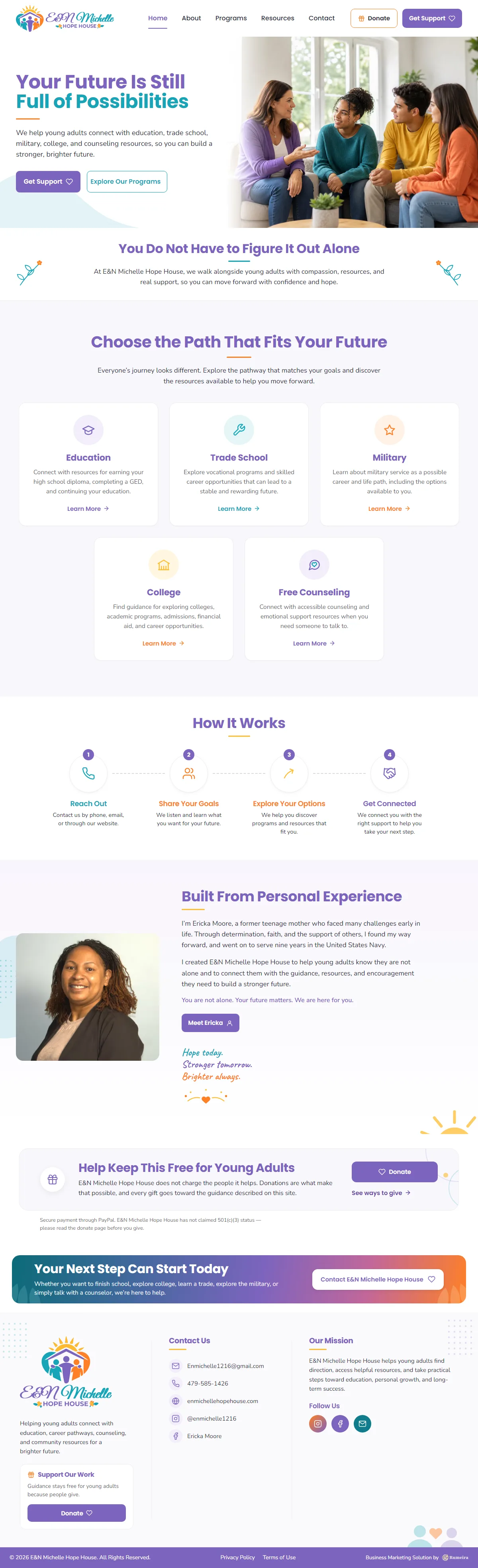
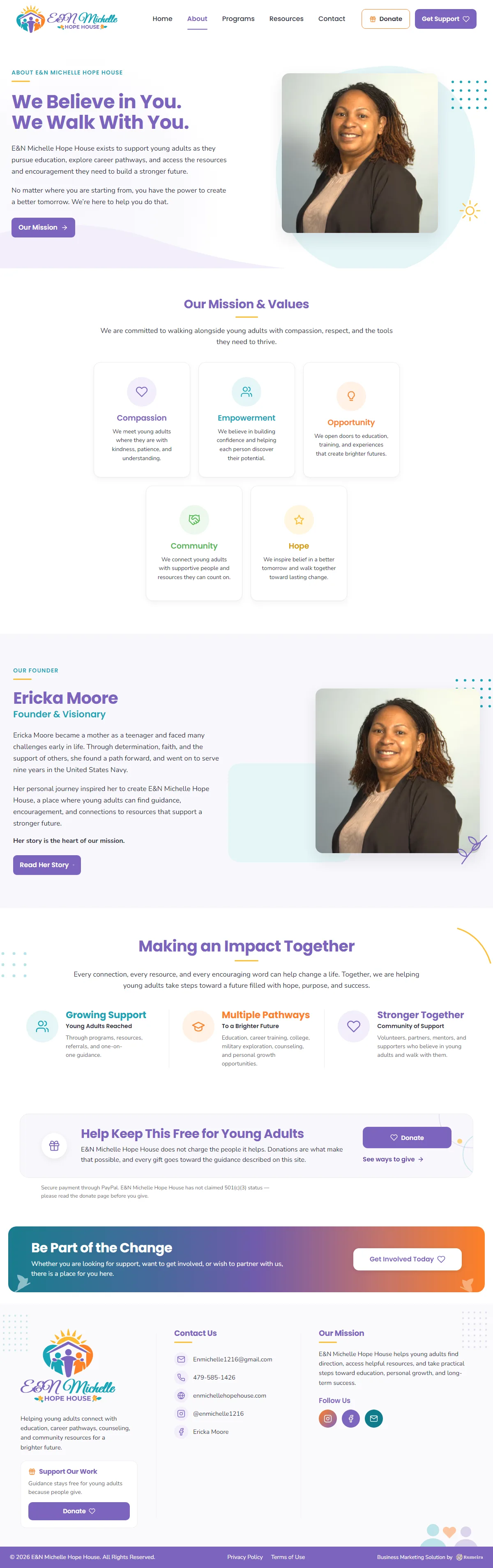
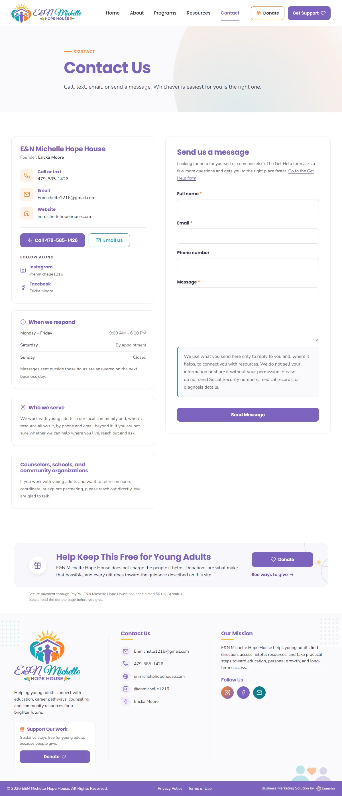
A warm, accessible website for a community youth-resource organization. Built with two front doors: one for young people looking for help, and one for the donors and volunteers who make that help possible.

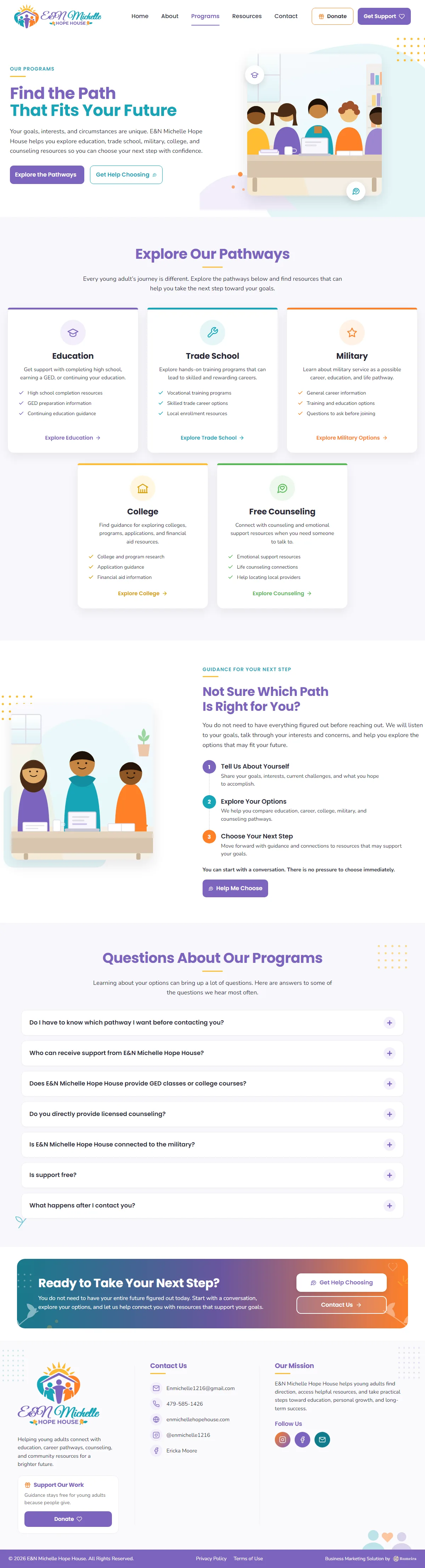
E&N Michelle Hope House is a community organization that helps young adults connect with resources: education, trade school, college, counseling, and more, at the moment guidance is needed.
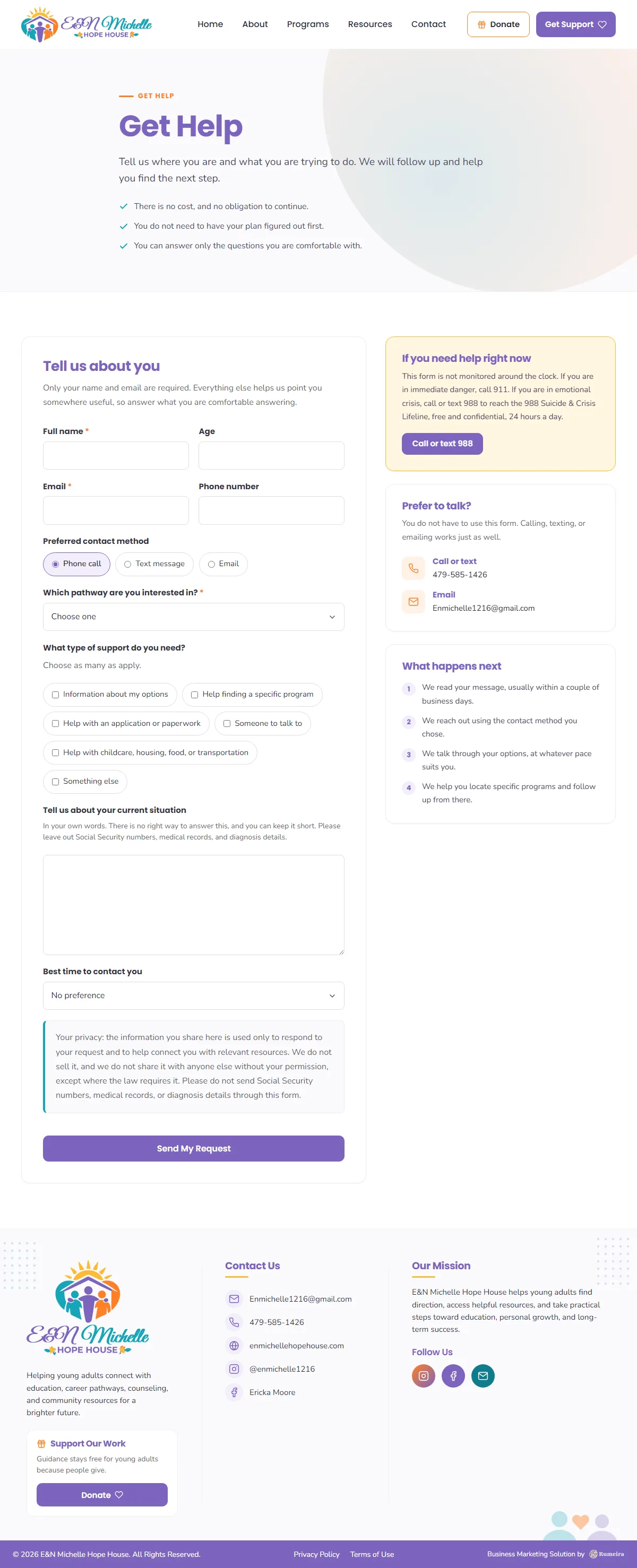
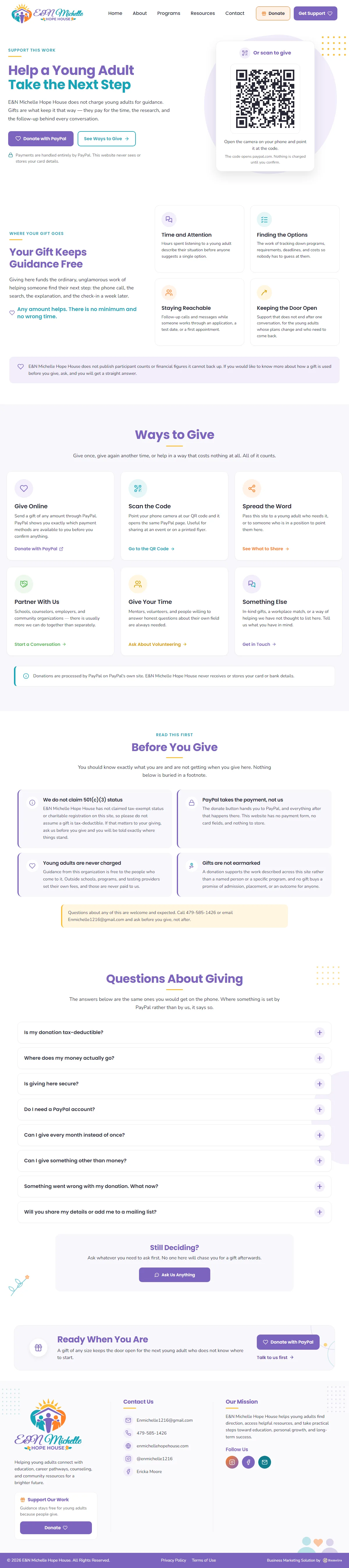
The site serves two very different visitors at once. A young person in a hard moment needs a clear, unintimidating path to support; a donor or volunteer needs to understand the mission and act on it in one step. Every page, color, and word was chosen with both in mind, and the language stays carefully honest about what the organization is and does.
A palette that feels like encouragement: purple carries the identity with warmth, teal and orange bring energy without alarm, and yellow marks the moments of hope across the site.
Identity, headings, primary actions
Secondary accents and program color-coding
Warm highlights and gentle urgency
Rules, marks of hope, small delights
Get Help and Donate sit one click from everywhere. Around them: who the organization is, what the programs do, and how to reach a real person.
Tell us where you want to go. We will map the marketing, the AI, and the measurement to get you there.